Here’s How The World Would Look If Countries Were Scaled According To Their Populations
www.awol.com.au
When it comes to country size, our great southern land is up there. Australia is the sixth largest country in the world, and when you look at a map of the planet, you can hardly miss us.
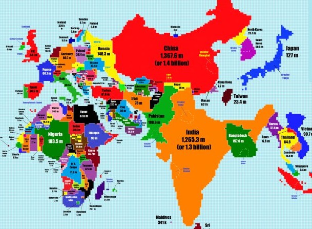
[related_articles]67393,63210,62945[/related_articles]But a uni student has taken the time to re-scale the globe based on population size and density, and spoiler alert – when it comes to people power, Australia is punching way below its weight. In an outcome that shocks no one – there are three people per square kilometre in Australia compared to India’s 382 – our sparse country has virtually disappeared from the globe in this scaled new world.
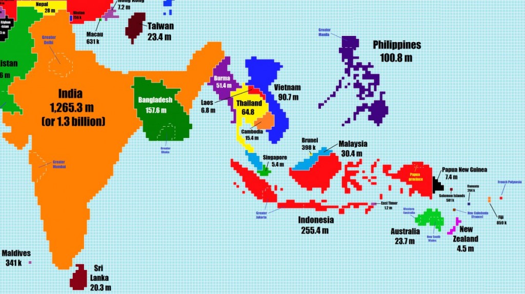 Created by uni student, Chase Mohrman, the map was originally posted on Reddit’s /r/mapporn thread. Mohrman used Microsoft Paint to design the map and Wikipedia for his statistics (as all good uni students do).

Aside from Australia downsizing, there were some other interesting changes:
Canada has become a pancake sitting flat on top of the US.

Pakistan is double the size of Iran.

And China expands dramatically.
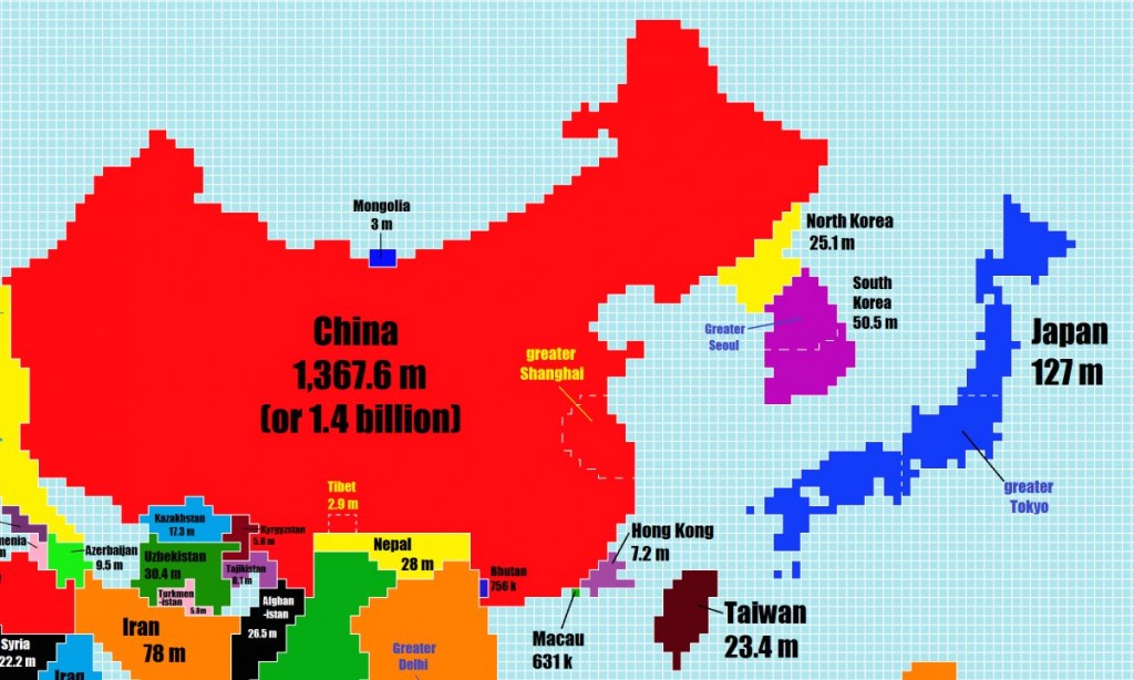
Thank god for uni students and their penchant for procrastination, ’cause this new world is a doozy.
(All images: Chase Mohrman)
www.awol.com.au


